

Understanding Intuitive Navigation
Imagine walking into a shopping mall where the signs are missing, stores are randomly placed, and there’s no clear path to get from one end to the other. Frustrating, right? Now, picture a well-designed mall with clear directories, intuitive pathways, and easily recognizable store sections, this is the difference between bad and intuitive navigation on a website.
At its core, intuitive navigation ensures that users can find what they need effortlessly, without confusion or frustration. It follows predictable patterns, logical website menu structures, and user-friendly layouts that make exploring a website as seamless as flipping through a well-organized book.
Why Does Intuitive Navigation Matter?
If visitors can’t find what they’re looking for in a few clicks, they’re likely to leave, just as you’d exit a store with a chaotic layout. But when a website has well-placed menus, breadcrumbs, a clear footer, and a logical sidebar, it becomes a seamless experience, keeping users engaged and encouraging them to explore further.
The SEO & UX Benefits of Intuitive Navigation
By designing a navigation system that feels natural and predictable, websites create a frictionless experience, just like a well-organized shopping mall where everything is exactly where you expect it to be.
What is Intuitive Navigation?
Have you ever walked into a well-organized library where every book is neatly categorized, clearly labeled, and easy to find? That’s exactly how intuitive navigation works on a website, it’s a structured, user-friendly system that helps visitors find what they need without effort or confusion.
Breaking It Down: The Essence of Intuitive Navigation
At its core, intuitive navigation means that users instinctively know where to go next without having to think too hard. It follows natural browsing habits and logical structures, making it easy to move through a website just as you would walk through a familiar building.
A well-designed navigation system typically includes:
By designing with intuitive navigation in mind, you’re not just making life easier for visitors, you’re also improving SEO, user engagement, and conversion rates.
Unveiling the Types of Navigation
Navigation comes in diverse forms, each catering to specific user needs. Let’s explore the six prominent types:
Top Navigation:
This familiar style rests atop the screen, providing direct access to essential sections. Think of it as the steering wheel of a website, guiding users to the core areas effortlessly.
Sidebar Navigation
A companion on many websites, this type resides along the side, offering a comprehensive overview of the available sections. It’s like the compass that keeps you oriented as you explore.
Footer Navigation
Found at the bottom, this navigation serves as a foundation for quick access to essential links. It’s akin to the map that helps you find your way back home.
Gesture-Based Navigation
In the age of touchscreens, gestures reign supreme. Swipe, pinch, and tap your way through interfaces, just like a magician casting spells with their wand.
Key Principles of Intuitive Website Navigation
Creating user-friendly navigation is more than just adding menus and links, it’s about designing a seamless experience that guides visitors effortlessly. The best navigation structures follow core principles that enhance usability, improve engagement, and boost SEO.
1. Consistency
Navigation should remain uniform across all pages. Whether it’s the menu placement, link style, or labels, a consistent design helps users build familiarity, making it easier to explore your site. Sudden changes in layout or naming conventions can cause confusion, leading to frustration and higher bounce rates.
2. Clear Hierarchy
An intuitive navigation hierarchy organizes content logically, helping users understand relationships between pages. A well-structured hierarchy includes:
For example, an eCommerce website may use:
3. Clarity
Every navigation element should be easy to understand at a glance. Avoid vague labels like “Stuff” or “More”, instead, use descriptive terms such as “Services,” “Pricing,” or “Support” so users know exactly what to expect.
4. Mobile-Friendliness
With a growing number of users browsing on mobile devices, mobile-friendly navigation is an essential feature of web design. This means:
By following these principles, websites can create user-friendly navigation that feels effortless, keeps visitors engaged, and enhances overall usability.
How to Design Intuitive Navigation for Your Website
A well-structured website starts with intuitive navigation, a system that guides visitors effortlessly to their desired destination. When you design intuitive website navigation, you enhance user experience, reduce bounce rates, and improve SEO. Here’s how to create a navigation system that works seamlessly for your audience.
Keep It Simple and Predictable
Users expect familiar navigation patterns. Stick to standard layouts, such as placing the menu at the top or side, using clear labels, and ensuring all important pages are within easy reach.
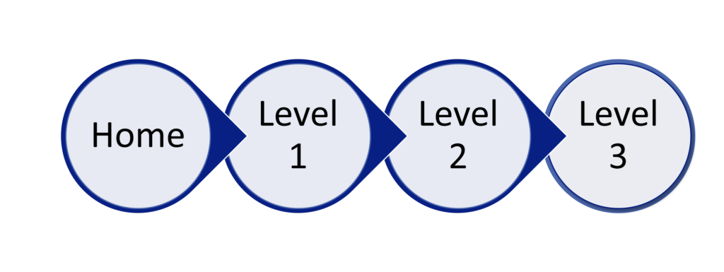
Use a Logical Page Hierarchy
Organize your content in a structured way:
Optimize for Mobile Users
A responsive website navigation ensures seamless browsing across all devices. Use a mobile-friendly menu (like a hamburger icon) and large, tappable buttons for better accessibility.
Include Search Functionality
For content-rich websites, an internal search bar improves usability. It allows users to quickly find what they need without scanning through multiple pages.
Test and Refine Your Navigation
Regularly analyze user behavior with tools like heatmaps and session recordings. A/B testing different layouts can help you refine your menu structure for better engagement.
Make Navigation Work for Your Business
When you design intuitive website navigation, you create a frictionless experience that keeps visitors engaged. Need help optimizing your website’s navigation? Consider consulting a professional web designer to refine your structure and boost conversions.
Common Mistakes to Avoid in Website Navigation
A well-structured website should guide visitors effortlessly. However, website navigation mistakes can frustrate users, increase bounce rates, and hurt your SEO. Here are the most common pitfalls to avoid when designing your site’s navigation.
1. Vague or Confusing Menu Labels
Users should instantly understand what each menu item means. Generic labels like “Stuff” or “More” leave visitors guessing. Instead, use clear, descriptive terms like “Services,” “Pricing,” or “Support” to set the right expectations.
2. Overcrowding the Navigation Bar
Too many links in your menu can overwhelm users. Stick to 5–7 main items and use dropdowns or a footer menu for additional pages. A clutter-free website navigation enhances clarity and engagement.
3. Ignoring Mobile Navigation
With mobile traffic surpassing desktop usage, failing to optimize mobile navigation is a major mistake. Ensure your menu is responsive, touch-friendly, and easy to access on smaller screens. A hamburger menu is often the best solution for compact displays.
4. Broken Links and Dead Ends
Nothing frustrates visitors more than clicking a link that leads to a 404 error. Regularly audit your website navigation to fix broken links and ensure users can always find what they need.
5. No Search Functionality
If your site has a lot of content, a search bar is essential. Without it, users may leave out of frustration when they can’t quickly locate information.
6. Inconsistent Navigation Across Pages
If your menu, buttons, or sidebar change position or design from page to page, users may struggle to navigate your site. Keep your navigation layout consistent to provide a smooth experience.
Optimize Your Website Navigation Today!
Avoiding these website navigation mistakes can improve user experience, engagement, and conversions. Need expert help? Let us design a seamless, user-friendly navigation system that enhances your website’s performance.
The SEO Benefits of Intuitive Navigation
A well-structured website isn’t just about user experience, it’s also a powerful SEO asset. Intuitive navigation directly influences how search engines understand, index, and rank your content. Let’s explore the key SEO benefits of a user-friendly site structure.
1. Improved Crawlability & Indexing
Search engines like Google rely on bots (crawlers) to scan and index website pages. If your navigation is cluttered, disorganized, or contains broken links, these crawlers may struggle to map out your site. A well-structured menu, clear internal links, and proper breadcrumbs ensure search engines can efficiently index all relevant pages, boosting visibility.
2. Enhanced Core Web Vitals & Page Experience
Google’s Core Web Vitals focus on page speed, interactivity, and visual stability, all of which are influenced by navigation. A streamlined menu and lightweight design reduce load times, prevent unexpected layout shifts, and create a seamless browsing experience. These factors improve user engagement, signaling to Google that your site provides value.
3. Lower Bounce Rates & Higher Dwell Time
If visitors struggle to find what they need, they’ll leave, hurting both conversions and SEO. Intuitive navigation keeps users engaged by making content easy to access. This leads to longer dwell times, lower bounce rates, and better rankings.
4. Stronger Internal Linking & Authority Distribution
A well-planned navigation structure helps distribute link equity across your site. Search engines see internal links as indicators of importance, so proper hierarchy and contextual linking strengthen SEO and help rank key pages more effectively.
5. Higher Click-Through Rates (CTR) from SERPs
An optimized site structure often results in sitelinks appearing beneath your main search result in Google. These additional links make your listing more visible, increasing CTR and driving more organic traffic.
Maximize Your SEO with Smart Navigation
Optimizing your website’s navigation isn’t just about aesthetics, it’s a game-changer for SEO benefits. By ensuring smooth crawlability, improving page experience, and reducing bounce rates, you’re setting your site up for long-term ranking success.
Best Tools & Resources for Improving Navigation
Optimizing your website’s navigation requires the right tools & resources to enhance usability, streamline design, and improve the overall user experience. Whether you’re auditing your current setup or designing a new site, these solutions will help you create a seamless and user-friendly navigation structure.
Navigation Testing Tools
Before finalizing your website’s menu structure, testing tools can help identify weak spots and areas for improvement.
UX Design & Wireframing Tools
A well-structured menu starts with intelligent design. These tools help create and refine intuitive navigation layouts:
Website Analytics & Behavior Tracking
Understanding how users navigate your site allows for continuous improvement.
Accessibility & Mobile-Friendly Navigation Tools
Ensuring your navigation works seamlessly across all devices improves SEO and user experience.
AI-Powered Navigation Optimization
Harnessing AI-driven tools can automate and enhance website navigation:
Let Us Help You Optimize Your Website Navigation
At Astrihost we specialize in building intuitive, SEO-friendly navigation that enhances user experience and drives conversions. Whether you need a full-site audit or a custom menu redesign, we have the expertise and tools to make it happen.
Get in touch today
Get in touch today and let’s create a seamless browsing experience for your visitors!

Hiring Professionals vs. DIY: What’s the Best Approach?
DIY: When Does It Make Sense?
Choosing the DIY route can be a good option if:
Challenges of DIY:
Hiring a Professional: Is It Worth the Investment?
If you want an optimized, user-friendly, and SEO-boosting navigation system, hiring an expert is often the better choice.
Challenges of Hiring a Pro:
What’s the Best Choice for You?
If you need basic navigation and have time to learn, DIY could work. But if you want a seamless, conversion-optimized experience, hiring a professional ensures long-term success.
Let’s chat! Our expert team can help design and implement SEO-friendly, user-centric navigation tailored to your business goals.
Conclusion & Final Tips
When it comes to great navigation, simplicity and clarity are key. A well-structured menu, strategic use of breadcrumbs, and an intuitive layout ensure that visitors can find what they need effortlessly, leading to better engagement, lower bounce rates, and improved SEO.
Key Takeaways for Optimizing Your Website Navigation:
Take the Next Step
If you’re unsure whether your navigation is helping or hurting your website’s performance, it’s time for a navigation audit. Assess your menus, links, and user flow, or let our experts take care of it for you.
Frequently Asked Questions
We are always happy to help, if you can’t find the information you are looking for please don’t hesitate to reach out to us!
Yes! We specialize in website revamps to modernise your design, improve speed, and enhance user experience.
Most websites are completed within 2-4 weeks, depending on complexity and specific requirements.
Absolutely! We provide website maintenance and support plans to keep your site secure, updated, and performing at its best.
Good navigation is simple, logical, and consistent, helping users find information quickly and improving site usability and SEO.
It enhances crawlability and indexing, improves Core Web Vitals, reduces pogo-sticking, and helps search engines understand site hierarchy, leading to better rankings.
Intuitive navigation refers to a website’s structure that allows users to find information effortlessly, without confusion. It follows logical patterns and user expectations to enhance the browsing experience.
It improves user experience, reduces bounce rates, increases engagement, and boosts SEO by making content easily accessible for both visitors and search engines.
Compare Our Affordable Design Packages
Our design packages are priced to meet any budget.
Our Business and e-commerce website design packages includes a premium theme and plugins!
Starter Design
R5000
R350 PER ADDITIONAL PAGES
Want to add additional function to this package? Click here for a list functionalities available
Business Design
R9000
R350 PER ADDITIONAL PAGES
E-Commerce Design
R12500
R350 PER ADDITIONAL PAGES
Did you find this article informative? Share it with your friends!
