
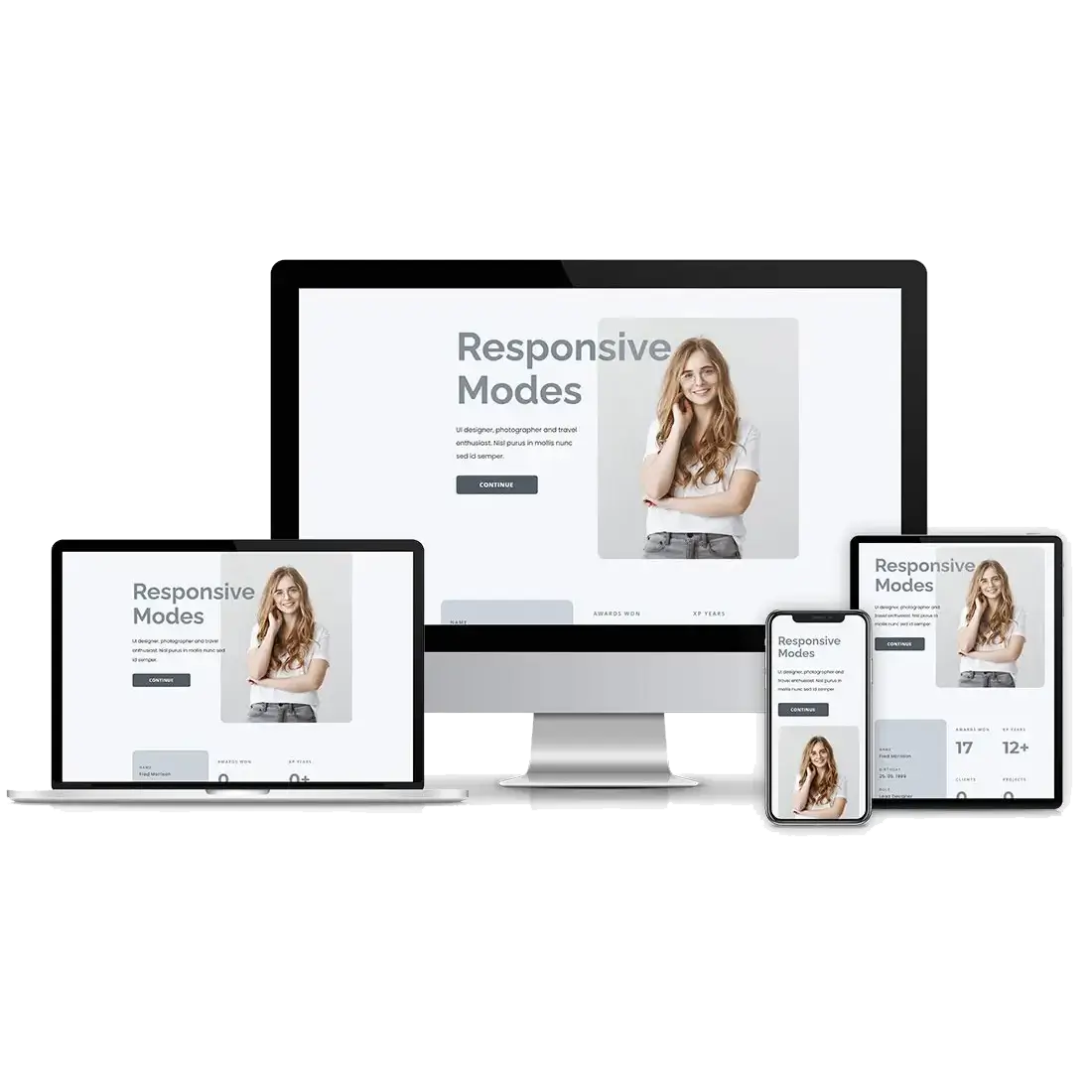
Responsive Web Design for Captivating User Experiences
Responsive web design is no longer optional, it’s essential. With users accessing websites from a variety of devices, including smartphones, tablets, laptops, and desktops, a seamless and adaptive browsing experience is crucial. Responsive web design ensures that a website dynamically adjusts its layout, images, and navigation to fit different screen sizes, providing optimal readability and usability.
By implementing fluid grids, flexible images, and CSS media queries, responsive design enhances user engagement by eliminating the need for excessive zooming or horizontal scrolling. This approach not only improves accessibility but also contributes to faster loading speeds, better SEO performance, and higher retention rates. Businesses that prioritize a mobile-friendly, responsive website benefit from improved search rankings and a more satisfied audience, leading to greater conversions and customer loyalty.
As the internet continues to evolve, responsive web design remains the foundation of an inclusive and user-centric online experience. Whether you’re running an eCommerce store, a blog, or a corporate site, ensuring adaptability across all devices is key to maintaining a competitive edge.
What is Responsive Web Design?
Responsive web design (RWD) is a modern approach to web development that ensures a website automatically adjusts to different screen sizes, resolutions, and devices. Instead of creating multiple versions of a website for desktops, tablets, and smartphones, responsive design uses fluid grids, flexible images, and CSS media queries to deliver a seamless user experience (UX) across all platforms.
Think of responsive web design like water in a container, it takes the shape of its environment, whether it’s a small glass (smartphone), a medium-sized bowl (tablet), or a large pitcher (desktop). Similarly, a well-designed responsive website reorganizes its content, navigation, and layout to fit any screen without compromising usability or readability.
From a UI (User Interface) perspective, responsive design optimizes spacing, typography, and interactive elements to ensure effortless navigation and engagement. This enhances both UX (User Experience) and accessibility, allowing users to interact with a website intuitively, no matter the device they’re using.
By implementing responsive web design, businesses improve usability, reduce bounce rates, and enhance search engine rankings, as Google prioritizes mobile-friendly websites. In today’s digital-first world, ensuring your website adapts to every screen is no longer an option, it’s a necessity.
Why Responsive Design Matters for User Experience
In an era where mobile browsing has surpassed desktop usage, responsive design matters more than ever for delivering a seamless and engaging user experience (UX). With users constantly switching between devices, a website must be able to adapt fluidly to different screen sizes, ensuring readability, usability, and accessibility across all platforms.
Changing User Behavior: Mobile vs. Desktop
Studies show that over 60% of web traffic now comes from mobile devices. Users expect fast-loading pages, intuitive navigation, and content that automatically fits their screens without zooming or horizontal scrolling. Websites that fail to meet these expectations often experience high bounce rates and lower engagement.
On the other hand, desktop users typically engage in more in-depth browsing, requiring a layout that supports multitasking, larger images, and detailed content. Responsive web design bridges this gap, allowing a single website to provide an optimized experience regardless of the device.
Impact on Engagement & Conversions
A poorly optimized website can frustrate users, leading them to abandon the page within seconds. Responsive design enhances mobile-friendliness, accessibility, and navigation, ultimately improving conversion rates and customer satisfaction. Additionally, search engines like Google prioritize mobile-friendly websites, meaning a responsive design directly contributes to better search rankings and increased organic traffic.
Future-Proof Your Website with Responsive Design
As technology continues to evolve, ensuring a flexible and user-centric design is crucial. Investing in responsive web design today means providing a consistent, high-quality experience that keeps visitors engaged—regardless of how they access your site.

Key Elements of a Responsive Website
Creating a truly responsive website requires a combination of smart design techniques and adaptable components. At the core of this approach are flexible grids and layouts, breakpoints, and optimized images and typography, all working together to ensure a seamless user experience across different devices.
Flexible Grids and Layouts: The Foundation of Responsiveness
A flexible grid system forms the backbone of responsive web design. Instead of using fixed-width layouts, flexible grids use relative units like percentages, ems, or rems, allowing elements to resize proportionally based on the screen size. This ensures content maintains its structure, whether viewed on a smartphone, tablet, or desktop.
Breakpoints: Defining How a Website Adapts
Breakpoints are predefined CSS rules that tell a website how to adjust its layout at specific screen widths. These ensure that a website looks and functions optimally on different devices. For example, a navigation menu may appear as a full bar on a desktop but collapse into a hamburger menu on a mobile screen.
Optimized Images and Typography: Enhancing Visual Consistency
Images and text must also be fluid and scalable to ensure readability and fast performance. Optimized images adjust their resolution based on screen size, reducing load times and improving user experience. Likewise, responsive typography uses scalable fonts that adapt dynamically, ensuring legibility on both small and large screens.
By integrating flexible grids, breakpoints, and optimized visuals, websites become adaptable and user-friendly, delivering a consistent and engaging experience across all devices.
Best Practices for Implementing Responsive Web Design
Implementing responsive web design requires strategic planning to ensure a seamless experience across all devices. One of the most critical decisions in this process is choosing between a mobile-first approach and a desktop-first approach, each of which affects how content and functionality are prioritized.
Mobile-First Approach: A User-Centric Strategy
The mobile-first approach prioritizes designing for smaller screens before scaling up to larger ones. This method is driven by the increasing dominance of mobile browsing and aligns with Google’s mobile-first indexing, which favors mobile-friendly websites in search rankings.
Key principles of mobile-first design:
By focusing on mobile users first, websites deliver a lightweight, efficient experience, which can then be progressively enhanced for larger screens.
Desktop-First Approach: Traditional but Less Scalable
The desktop-first approach involves designing for larger screens first and then adapting the layout for smaller devices. This method was common when desktop browsing dominated, but it can lead to challenges when scaling down to mobile.
Common pitfalls of desktop-first design:
While the desktop-first approach may still be relevant for certain industries (such as data-heavy dashboards or enterprise software), it often requires more adjustments to create a truly responsive experience across all devices.
Choosing the Right Approach
For most websites, a mobile-first strategy is the preferred method, ensuring performance, accessibility, and SEO benefits from the start. Regardless of the approach, flexible grids, media queries, and optimized assets remain essential to delivering a smooth, responsive experience for every user.
Responsive Web Design Tools & Testing Methods
Ensuring a seamless user experience across all devices requires rigorous testing responsiveness techniques. A well-designed website should adapt flawlessly to different screen sizes, resolutions, and browsers, preventing issues like distorted layouts, inaccessible navigation, or slow load times. Fortunately, various tools streamline the process, allowing developers and designers to fine-tune their responsive designs efficiently.
Essential Tools for Testing Responsiveness
Google’s Mobile-Friendly Test
Google’s Mobile-Friendly Test is a quick and free way to check whether a website meets mobile optimization standards. It analyzes page loading speed, layout adaptability, and usability, offering insights on areas that need improvement. Given Google’s emphasis on mobile-first indexing, ensuring a positive score on this tool is crucial for SEO performance.
BrowserStack
BrowserStack is a powerful cloud-based testing platform that allows users to preview websites across real devices and multiple browsers. Unlike emulators, it provides an accurate representation of how a site performs on actual smartphones, tablets, and desktops. This is essential for detecting cross-browser compatibility issues and ensuring a smooth experience for all users.

Responsive Design Mode in Browsers
Most modern browsers, including Chrome and Firefox, come with built-in Developer Tools that enable real-time testing of a website’s responsiveness. Users can switch between different screen sizes, simulate touch interactions, and inspect elements to refine the design further.
Final Check: The Importance of Manual Testing
While automated tools provide valuable insights, manual testing on actual devices remains an essential step in the process. This ensures that interactive elements, images, and typography maintain their integrity across various screen dimensions.
Optimize Your Website for Every User
By leveraging tools like Google’s Mobile-Friendly Test and BrowserStack, businesses can guarantee a flawless responsive web design experience. Regularly testing responsiveness ensures that visitors enjoy a consistent, high-quality experience, no matter how they access your site.
Comparing Responsive vs. Adaptive Web Design
Choosing the right web design approach is crucial for delivering a seamless user experience across different devices. When comparing responsive vs. adaptive design, both methods aim to optimize website performance, but they differ in flexibility, implementation, and scalability. Understanding their strengths and limitations can help businesses make informed decisions about the best approach for their needs.
Responsive Web Design: A Fluid, Scalable Approach
Responsive design uses flexible grids, media queries, and scalable elements to ensure a website automatically adjusts to different screen sizes. This dynamic approach provides a consistent experience across desktops, tablets, and mobile devices without requiring separate layouts for each screen type.
Pros of Responsive Design:
Cons of Responsive Design:
Adaptive Web Design: Tailored for Specific Devices
Adaptive design delivers predefined layouts based on detected screen sizes. Instead of a fluid layout, developers create multiple versions of a website (e.g., for desktop, tablet, and mobile). This allows for highly customized experiences, but requires more effort to maintain.
Pros of Adaptive Design:
Cons of Adaptive Design:
Which Approach is Right for Your Business?
For most businesses, responsive design is the preferred choice due to its cost-efficiency, scalability, and SEO benefits. However, industries requiring highly specialized interfaces (such as enterprise software or gaming platforms) may benefit from an adaptive approach.
Need help choosing the best web design strategy? Our team specializes in building high-performing, mobile-friendly websites tailored to your business goals. Contact us today to create a website that adapts seamlessly to your audience’s needs!
Need help choosing the best web design strategy?
Our team specializes in building high-performing, mobile-friendly websites tailored to your business goals. Contact us today to create a website that adapts seamlessly to your audience’s needs!

Future Trends in Responsive Web Design
Responsive web design is evolving to keep up with changing user behaviors and technological advancements. AI-driven personalization, progressive web apps (PWAs), and voice search optimization are shaping the future of user experiences, ensuring websites are more adaptive, engaging, and accessible.
AI-Powered Personalization
AI is transforming web design by dynamically adjusting layouts, navigation, and content based on user behavior. Websites can analyze browsing habits and environmental factors to enhance usability. This ensures a more personalized and seamless experience across devices.
The Rise of Progressive Web Apps (PWAs)
PWAs merge the best features of websites and mobile apps, offering offline access, push notifications, and fast load times. Companies like Starbucks and Twitter have embraced PWAs to improve mobile engagement. As mobile-first indexing becomes the norm, PWAs will play a vital role in web design.
Voice Search Optimization
With the rise of voice assistants like Google Assistant and Alexa, web design is shifting toward conversational UI. Voice search requires structured, easy-to-access content, faster load speeds, and simplified navigation to enhance user experience.
The Future of Responsive Design
As AI, PWAs, and voice search continue to evolve, responsive design is becoming more intelligent and interactive. Businesses that integrate these advancements will stay ahead in delivering seamless, future-ready digital experiences. Now is the time to adopt these innovations and ensure your website remains competitive.
Frequently Asked Questions
We are always happy to help, if you can’t find the information you are looking for please don’t hesitate to reach out to us!
Responsive design adjusts dynamically to screen size, while adaptive design uses predefined layouts for specific devices.
Yes, optimized responsive design improves page load speed, enhancing both user experience and SEO performance.
Fluid grids, flexible images, media queries, and mobile-friendly navigation are essential to ensuring seamless adaptability.
Responsive design ensures your website looks and functions well on all devices, improving user experience and boosting SEO rankings.
Compare Our Affordable Design Packages
Our design packages are priced to meet any budget.
Our Business and e-commerce website design packages includes a premium theme and plugins!
Starter Design
R5000
R350 PER ADDITIONAL PAGES
Want to add additional function to this package? Click here for a list functionalities available
Business Design
R9000
R350 PER ADDITIONAL PAGES
E-Commerce Design
R12500
R350 PER ADDITIONAL PAGES
Did you find this article informative? Share it with your friends!
