

Unveiling the Power of Website Design Features
A well-crafted website isn’t just about looking good, it’s about delivering a seamless user experience, driving conversions, and strengthening your brand’s online presence. To stay ahead in today’s digital landscape, your site needs to incorporate the right website design features, balancing aesthetics, functionality, and performance.
In this guide, we’ll explore 15 essential website design features that define a high-performing website. From intuitive navigation and lightning-fast load times to mobile responsiveness and SEO optimization, these elements work together to enhance usability and ensure long-term success. Whether you’re building a new site or improving an existing one, mastering these features will help you create an engaging, user-friendly, and search-optimized website.
One of the most crucial aspects of a well-designed website is how easily users can navigate it. After all, even the most visually stunning site won’t be effective if visitors struggle to find what they need.
User-Friendly Navigation: The Power of Intuitive Navigation
When visitors land on a website, they expect to find information quickly and effortlessly. Intuitive navigation ensures users can seamlessly explore a site without confusion or frustration. A well-structured menu and clear pathways not only enhance user experience but also improve engagement, keeping visitors on your site longer and guiding them toward key actions.
What is Intuitive Navigation?
Intuitive navigation refers to a website’s ability to help users find what they need without excessive clicks or guesswork. It follows familiar design principles, logical content structures, and easily recognizable elements like menus, breadcrumbs, and calls to action (CTAs).
Why Intuitive Navigation is Essential
- Boosts User Engagement
A smooth browsing experience keeps visitors exploring your content instead of leaving in frustration. Websites with intuitive navigation encourage longer sessions and reduce bounce rates. - Enhances User Experience (UX)
The best websites prioritize user needs, ensuring menus, buttons, and links are structured logically. Simple, predictable navigation minimizes cognitive load, making the browsing experience enjoyable. - Improves SEO & Conversions
Search engines favor well-structured sites that provide easy access to content. Implementing the best practices of intuitive website navigation can lead to better rankings and higher conversion rates, as users can quickly locate products, services, or contact forms.
Best Practices for Intuitive Website Navigation
Wrapping It Up
A website with intuitive navigation functions like a GPS, it directs users to their destination with minimal effort. By focusing on user-friendly menus and clear pathways, you create an experience that boosts engagement, enhances user experience, and increases conversions. Implementing the best practices of intuitive website navigation ensures that visitors stay longer, interact more, and ultimately take action.
But great navigation alone isn’t enough, how you present information also plays a crucial role. That’s where visual hierarchy comes in, helping to direct users’ attention to the most important elements first.
Strong Visual Hierarchy: A Key Principle in Web Design
Visual hierarchy in web design is a fundamental principle that guides users’ attention, ensuring they focus on the most important elements first. By strategically arranging content, using contrast, spacing, and typography, designers can create a seamless experience that enhances both usability and SEO optimization.
What is Visual Hierarchy in Web Design?
Visual hierarchy in web design refers to the intentional structuring of elements on a webpage to indicate their importance. It helps users quickly process information by leading their eyes naturally from one section to another. Without a clear hierarchy, websites can feel cluttered, making it difficult for visitors to engage with the content.
Essential Elements of a Strong Visual Hierarchy
- Color Contrast for Emphasis
High color contrast between text and background improves readability and draws attention to key elements like CTAs (Call-to-Action buttons). A well-balanced contrast ensures clarity without overwhelming users. - Font Sizes & Typography
Larger fonts naturally grab attention, making headlines stand out. Using a combination of font weights and styles further enhances SEO optimization, as properly structured text is easier for both users and search engines to understand. - Whitespace for Clarity
Adequate whitespace (negative space) prevents visual clutter and improves content readability. By spacing out text, images, and buttons, designers create a clean, organized layout that enhances user experience.
Why Visual Hierarchy Matters
The Bottom Line
A strong visual hierarchy in web design ensures that users can easily navigate and interact with content. By leveraging color contrast, font sizes, and whitespace, designers create an engaging and structured layout that enhances both usability and search rankings.
But even the most well-structured layout won’t be effective if it doesn’t adapt to different screen sizes. With mobile browsing dominating the web, ensuring responsiveness is no longer just a trend—it’s essential for accessibility, engagement, and success.
Mobile Responsiveness: A Non-Negotiable in Modern Web Design
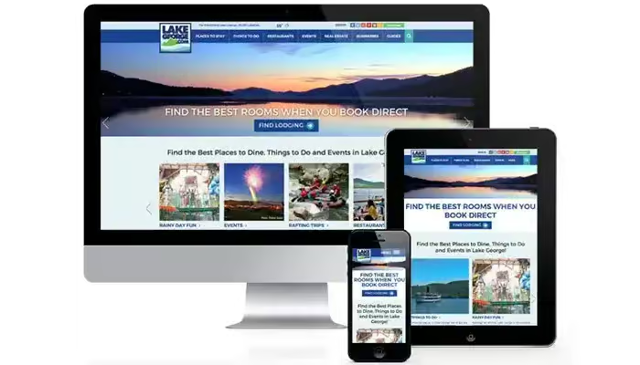
Today, mobile responsiveness is no longer optional, it’s a necessity. With over half of global web traffic coming from mobile devices, websites must adapt seamlessly to different screen sizes. A site that fails to be mobile-friendly risks losing visitors, increasing bounce rates, and even harming its search engine rankings.
What is Mobile Responsiveness?
Mobile responsiveness refers to a website’s ability to automatically adjust its layout, images, and elements to fit various screen sizes, whether it’s a smartphone, tablet, or desktop. This is achieved through responsive design, a development approach that uses flexible grids, fluid images, and CSS media queries to ensure an optimal viewing experience across all devices.
Think of mobile responsiveness like water flowing into different containers. Just as water seamlessly takes the shape of any glass, bottle, or jug it’s poured into, a well-designed responsive website effortlessly adjusts to different screen dimensions without distorting content or functionality.
Why Mobile Optimisation Matters
- Improved User Experience (UI)
A mobile-optimized site enhances UI by ensuring that text remains readable, images load correctly, and navigation stays intuitive. Visitors shouldn’t have to pinch and zoom or scroll horizontally just to access information. - SEO and Search Rankings
Search engines, particularly Google, prioritize mobile-friendly websites. With mobile-first indexing, Google primarily crawls and ranks the mobile version of your site before considering the desktop version. A lack of mobile responsiveness can negatively impact rankings, reducing organic visibility. - Higher Engagement and Conversions
A responsive design helps businesses retain visitors and encourage conversions. Studies show that users are more likely to engage with a site that loads quickly and displays correctly on their devices. Whether it’s completing a purchase or filling out a form, seamless functionality boosts trust and interaction. - Faster Load Times
A mobile-optimized website loads faster by reducing unnecessary scripts, optimizing images, and prioritizing essential elements. Page speed directly impacts user satisfaction, if a site takes too long to load, visitors are likely to leave within seconds.
Key Features of a Mobile-Friendly Website
Final Thoughts
A mobile-responsive website isn’t just about aesthetics, it’s about usability, SEO, and business growth. If your site doesn’t adapt to mobile users, you’re missing out on a significant audience. Just as water effortlessly conforms to its container, your website should seamlessly fit every screen, offering a smooth, engaging experience for all users.
However, true inclusivity goes beyond responsiveness, it requires a commitment to accessibility. A website should be designed for all users, including those with disabilities, ensuring a seamless and equitable digital experience.
Accessibility for All Users: Designing an Inclusive Web Experience
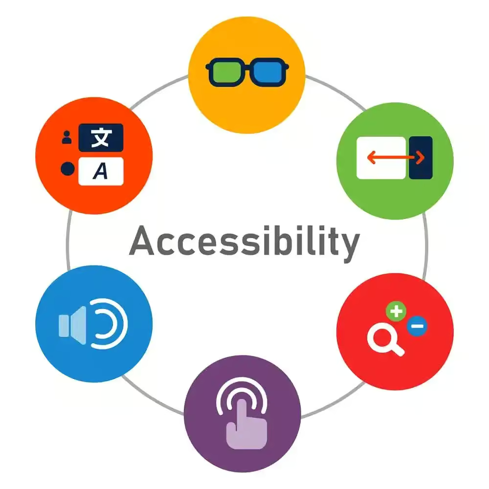
Creating an inclusive digital space starts with a commitment to design for accessibility. A website that caters to diverse users, including those with disabilities, ensures a seamless experience for everyone, regardless of their abilities or the devices they use. In today’s digital landscape, accessibility is not just a best practice, it’s necessary for inclusivity and compliance with global web standards.
Why Design for Accessibility Matters
Key Elements of Accessible Web Design
A website built with design for accessibility in mind is not only a legal and ethical responsibility but also a business advantage. By ensuring an inclusive, user-friendly experience, you open the doors to a larger audience while enhancing usability, SEO, and brand credibility.
Accessibility isn’t the only factor that impacts user experience. Speed is just as critical—because no matter how well-designed or inclusive a website is, if it loads too slowly, visitors will leave before engaging with your content.
Fast Loading Speed: A Core Pillar of Essential Website Design Features
A website’s loading speed is one of the most essential website design features, directly influencing user experience, search rankings, and conversion rates. In a world where attention spans are shrinking, even a one-second delay can lead to significant drops in engagement and revenue. Whether you’re investing in professional website design services or optimizing an existing site, ensuring fast load times should be a top priority.
Why Loading Speed Matters in Website Design
- User Experience (UI) & Retention
A slow website frustrates visitors, increasing bounce rates. Website design for better user experience (UI) prioritizes speed, ensuring users find what they need quickly and effortlessly. - Search Engine Optimization (SEO)
Google considers page speed a ranking factor, meaning slow sites are less likely to appear in top search results. Faster websites are rewarded with better visibility, driving organic traffic. - Higher Conversions & Sales
Speed impacts business success. The best website design features for conversions always include fast loading times, as users are more likely to complete purchases or sign up when pages load instantly.
Key Factors Affecting Website Speed
Key Takeaways
Fast-loading speed isn’t just a technical detail, it’s a core component of essential website design features. Prioritizing speed enhances UI, boosts conversions, and strengthens SEO, making your website a powerful tool for success. If you want a site that performs effortlessly, consider working with professional website design services to ensure optimal speed and user experience.
But even a fast, well-optimized site won’t hold visitors’ attention without compelling content. Let’s explore what makes content truly effective in capturing and engaging your audience.
High-Quality, Relevant Content: What Is Good Content?
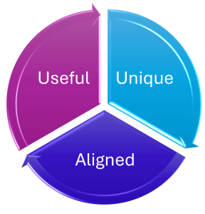
Content is the foundation of any successful website, but what is good content? It’s more than just words on a page, it’s information that is SEO-optimized, useful, readable, and engaging for your target audience. Good content solves problems, answers questions, and keeps readers coming back for more.
Key Elements of High-Quality Content
1. Relevance and Value
Content should match user intent and provide valuable insights. Whether it’s a blog post, product page, or landing page, it should address the reader’s needs while staying focused and informative.
Best practice: Before writing, research your audience’s pain points and tailor content to solve their problems effectively.
2. SEO-Optimized for Better Visibility
Even the best content won’t succeed if it’s not search engine friendly. A well-optimized piece should include:
Best practice: Use an SEO checklist to ensure every piece meets optimization standards.
3. Readability and Engagement
Good content is easy to read and engaging. If readers struggle to understand or scan your content, they’ll leave quickly. To improve readability:
Best practice: Run content through readability tools like Hemingway Editor to ensure it’s clear and concise.
Conclusion
What is good content? It’s SEO-optimized, useful, readable, and engaging. By following best practices for beginners and experienced writers alike, you can create content that attracts visitors, keeps them engaged, and boosts your website’s authority.
However, great content needs the right structure to be effective. Visual hierarchy plays a crucial role in guiding visitors through your site, ensuring they focus on key messages without feeling overwhelmed.
SEO-Optimized Structure: Enhancing Visual Hierarchy in Web Design
A well-structured website is essential for both user experience and SEO optimization. When search engines and users can easily navigate a site, content becomes more accessible, improving visibility and engagement. One of the key elements of an effective structure is visual hierarchy in web design, which ensures that important information stands out while maintaining a logical flow.
Key Elements of an SEO-Optimized Website Structure
- Heading Tags for Content Organization
Proper use of heading tags (H1, H2, H3, etc.) helps structure content, making it easier to scan. The H1 tag should contain the primary focus of the page, while H2 and H3 tags break down sections logically. This hierarchy improves readability and strengthens SEO optimization by signaling content relevance to search engines. - URL Structures for Better Navigation
Clean and descriptive URL structures improve both user experience and search rankings. URLs should be short, keyword-rich, and free from unnecessary characters. For example:- Good URL:
example.com/visual-hierarchy-web-design - Bad URL:
example.com/page?id=12345
- Good URL:
- Meta Descriptions for Click-Through Rates (CTR)
A compelling meta description provides a summary of the page’s content, enticing users to click. This small snippet, typically under 160 characters, should include the primary keyword naturally while maintaining clarity and relevance. - Visual Hierarchy for Content Prioritization
The visual hierarchy in web design ensures that key elements like headlines, CTAs, and important messages are prominently displayed. By utilizing whitespace, font sizes, and color contrast, designers can guide visitors’ attention while maintaining a structured layout that aligns with SEO optimization best practices.
Why SEO-Optimized Structure Matters
Let’s Summarise
A strong SEO-optimized structure combines visual hierarchy in web design with heading tags, URL structures, and meta descriptions to create a well-organized and user-friendly experience. When properly implemented, this approach enhances search visibility, improves usability, and ensures content is easy to navigate for both users and search engines.
But a well-structured site doesn’t just rely on visual elements, it also needs strong internal linking. Strategic internal links connect your content, making it easier for both users and search engines to explore your site effectively.
Internal Linking Strategy: Enhancing SEO & User Experience
A well-planned internal linking strategy is a fundamental part of website optimization, helping both search engines and users navigate your content efficiently. By strategically connecting relevant pages within your site, you distribute link equity, enhance crawlability, and improve user engagement.
Why Internal Linking Matters
Internal Linking Best Practices
The Bottom Line
A well-executed internal linking strategy enhances both SEO performance and user engagement. By following internal linking best practices, such as using optimized anchor text, strategic link placement, and structured navigation, you create a search-friendly and user-centric website that drives traffic and conversions.
Internal links help guide users through your site, but to drive real action, you need compelling calls-to-action (CTAs). A well-placed CTA can turn passive visitors into engaged customers.
Engaging Call-to-Action (CTA) Buttons: What Makes a Good Call-to-Action?
A Call-to-Action (CTA) is the guiding force that directs users toward a specific goal, whether it’s making a purchase, signing up for a newsletter, or downloading a resource. But what makes a good call-to-action? It’s not just about placing a button on a webpage; it’s about using power words, strategic placement, and a design that encourages action.
Think of a CTA like a well-placed exit sign in a building, users should instantly know where to go next without confusion. If your CTA is vague, hidden, or uninspiring, users may leave without taking action, leading to missed conversions.

Key Elements of a High-Converting CTA
- Use Power Words to Drive Action
- Power words are persuasive terms that evoke emotions and urgency. Instead of generic text like “Click Here,” opt for engaging CTAs such as:
- “Get Started Now” – Creates a sense of immediacy.
- “Claim Your Free Trial” – Highlights exclusivity and value.
- “Boost Your Growth Today” – Encourages positive action.
- By incorporating these words, your CTAs become more compelling and drive more conversions.
- Power words are persuasive terms that evoke emotions and urgency. Instead of generic text like “Click Here,” opt for engaging CTAs such as:
- How Many CTAs Should You Use?
- A page should have just enough CTAs to guide users without overwhelming them. A general rule:
- Landing Pages: 1–2 clear CTAs to avoid distractions.
- Blog Posts: 1 main CTA at the end, plus 1 subtle one in the content.
- Homepages: Multiple CTAs leading to different sections but designed in a way that doesn’t clutter the page.
- Too many CTAs can confuse users, while too few might not give them enough direction. Finding the right balance is key.
- A page should have just enough CTAs to guide users without overwhelming them. A general rule:
- Placement and Design for Maximum Impact
- Strategic placement of CTAs ensures that users naturally find them as they navigate your website. Best practices include:
- Above the fold – Placing a primary CTA where users can see it without scrolling.
- Within high-engagement sections – After key benefits or testimonials.
- At the end of content – Encouraging the next step after consuming information.
- Strategic placement of CTAs ensures that users naturally find them as they navigate your website. Best practices include:
Design Tips:
Let’s Recap
A well-crafted CTA is clear, visually striking, and action-driven. By understanding what makes a good call-to-action, using power words, and optimizing CTA placement, you can significantly boost conversions. Think of your CTA as a signpost leading users to their next step, make sure it’s impossible to miss!
Beyond CTAs, social media plays a vital role in keeping your audience engaged. Integrating social platforms into your website can amplify your reach and drive even more conversions.
Affordable Website Design
Your website is more than just a digital storefront, it’s an opportunity to make a lasting impression on your audience. With our Website Design Service, you can rest assured that your online presence will be in capable hands. Let’s work together to create a website that not only meets but exceeds your expectations.

Social Media Integration: A Must-Have for Modern Websites
Social media integration is more than just adding share buttons, it’s a powerful strategy to expand your online presence, boost engagement, and drive conversions. A website seamlessly connected to social media platforms enhances user experience, builds brand credibility, and encourages interaction.
The Importance of Social Media Integration
A website without social media integration misses out on a major traffic and engagement opportunity. Whether you’re an eCommerce store, blog, or service provider, connecting your site to social platforms ensures a seamless, engaging experience that strengthens your brand and boosts conversions.
While social media keeps users engaged, direct communication is still crucial. Providing clear and accessible contact information builds trust and ensures visitors can reach you effortlessly.
Clear Contact Information: Building Trust and Accessibility
Providing clear contact information on your website is essential for establishing credibility and ensuring seamless communication with visitors. Whether you run an eCommerce store, a service-based business, or a corporate website, easy-to-find contact details enhance trust and accessibility, making it easier for potential customers to reach out.
Why Clear Contact Information Matters
Best Practices for Displaying Contact Information
Conclusion
Clear contact information is more than a convenience, it’s a trust signal that reassures visitors they can reach you effortlessly. A well-structured contact section enhances user experience, strengthens credibility, and improves SEO, making it an essential feature for any website.
But trust doesn’t stop at contact details, security is just as important. If your website isn’t secure, visitors will hesitate to share their information, affecting both trust and conversions.
Secure and SSL-Certified: Why HTTPS Is Crucial for Trust and SEO
Imagine walking into a store with a broken security system, would you feel safe handing over your credit card details? Probably not. The same applies to websites. If a site lacks HTTPS (SSL certification), visitors are less likely to trust it, especially when entering sensitive information.
Today, HTTPS is crucial for trust and SEO. It encrypts data, protects user privacy, and even gives websites a ranking boost on search engines.
What Is HTTPS and How Does It Work?
HTTPS (HyperText Transfer Protocol Secure) ensures that the data transferred between a user’s browser and a website is encrypted and protected from cyber threats like hacking or identity theft. This security is provided through SSL certificates, which act as digital passports that authenticate and encrypt communication.
Without HTTPS, browsers display “Not Secure” warnings, deterring users from staying on the site or making transactions.
Why HTTPS Matters for SEO and User Trust
Types of SSL Certificates
There are different types of SSL certificates, each offering varying levels of security:
- Domain Validation (DV) – Basic encryption for blogs or small websites.
- Organization Validation (OV) – Verifies domain ownership and business legitimacy.
- Extended Validation (EV) – Highest security level, used by banks and e-commerce sites.
Choosing the right SSL certificate depends on your website’s security needs.
Let’s Recap
So, why is HTTPS crucial for trust and SEO? It secures data, builds user confidence, and improves search rankings. If you wouldn’t enter credit card details on an untrusted site, why should your visitors? Upgrading to SSL certification isn’t just an option, it’s a necessity for a secure and successful website.
Security is essential, but so is every detail of your site’s layout—including the footer. A well-designed footer enhances navigation, accessibility, and credibility.
Well-Designed Footer: Enhancing Navigation & User Experience
A well-structured website footer is more than just an afterthought, it’s a crucial element of website footer design that improves user experience, accessibility, and SEO. By incorporating essential links, branding elements, and contact details, a footer acts as a navigation safety net, ensuring visitors find what they need, even after scrolling through an entire page.
Key Elements of an Effective Website Footer
Website Footer Design Trends for Modern Layouts
Final Thoughts
A well-designed website footer is a small but powerful component of a modern website layout. By aligning with website design trends and best practices, you create a professional and user-friendly experience that enhances navigation, credibility, and conversions.
Beyond navigation, your footer can also provide valuable insights. By incorporating analytics, you can track performance and make data-driven improvements.

Analytics & Performance Tracking: Enhancing Website Insights
A well-structured website footer design is not just about aesthetics, it can also serve as a strategic point for analytics and performance tracking. By integrating Google Analytics, heatmaps, and Microsoft Clarity, businesses can gain valuable insights into user behavior, engagement patterns, and conversion bottlenecks.
Key Metrics to Track for Website Performance
User Behavior Analysis: Tools like Google Analytics help track page views, session duration, and bounce rates, providing a clear picture of how visitors interact with your site.
How to Implement Website Analytics in Your Footer
Conclusion
Integrating analytics and performance tracking into your website footer design is essential for data-driven optimization. By leveraging tools like Google Analytics, heatmaps, and Microsoft Clarity, businesses can enhance user experience, boost engagement, and improve conversions with actionable insights.
Analyzing performance is just the beginning. To future-proof your website, you need a scalable design that can grow with your business.
Scalability for Growth: Building a Future-Ready Digital Foundation
Scalability is the backbone of a high-performing website or online business. As traffic increases and user demands evolve, a scalable system ensures smooth performance without downtime, slow load speeds, or structural limitations. Think of it like constructing a house, you don’t build for today’s needs alone; you plan for future expansions, ensuring stability, efficiency, and adaptability.
What is Scalability and Why Does it Matter?
Scalability refers to a system’s ability to handle growth efficiently. Whether it’s a website, an application, or a business model, designing for scalability means ensuring that increased traffic, transactions, or data loads don’t negatively impact performance.
A well-optimized scalable system:
Without proper scalability planning, businesses often face bottlenecks, slow loading speeds, and potential revenue loss.
Common Scalability Challenges & Solutions
Infrastructure Limitations
Challenge: A sudden influx of visitors can overwhelm servers, causing crashes.
Solution: Use cloud hosting, load balancing, and caching mechanisms to distribute traffic efficiently.
Database Performance Issues
Challenge: Large databases can slow query execution times, affecting website responsiveness.
Solution: Implement database indexing, optimization techniques, and scalable storage solutions like NoSQL.
Traffic Spikes & Load Handling
Challenge: Rigid website structures make expanding features or integrating new tools difficult.
Solution: Opt for modular website architecture and flexible APIs that allow seamless growth.
Designing for Future Growth
To ensure long-term scalability, businesses must incorporate future-proof strategies from the start:
Final Thoughts
Scalability isn’t just about handling today’s traffic, it’s about future-proofing your business. By addressing performance challenges, planning for growth, and using scalable technologies, you ensure that your website or platform evolves effortlessly alongside your business needs.
Frequently Asked Questions
We are always happy to help, if you can’t find the information you are looking for please don’t hesitate to reach out to us!
From a trusted provider like AstriHost. Search for your preferred domain, register it, choose a hosting plan, and launch your site.
A domain name is your website’s address, while web hosting is the server space where your website files are stored. You need both to make your website live.
Yes. You can move from shared or cPanel hosting to managed WordPress hosting easily. AstriHost can assist with a smooth, zero-downtime migration.
Absolutely. It’s designed to simplify complex hosting tasks with a visual interface.
cPanel is a control panel used to manage hosting; WordPress hosting is a hosting environment optimized specifically for WordPress websites.
Compare Our Affordable Design Packages
Our design packages are priced to meet any budget.
Our Business and e-commerce website design packages includes a premium theme and plugins!
Starter Design
R5000
R350 PER ADDITIONAL PAGES
Want to add additional function to this package? Click here for a list functionalities available
Business Design
R9000
R350 PER ADDITIONAL PAGES
E-Commerce Design
R12500
R350 PER ADDITIONAL PAGES
Did you find this article informative? Share it with your friends!
