

Why Website Design Matters for Success
Your website is like the front door to your business, it’s the first thing visitors see, and their first impression can make or break their decision to stay. A poorly designed website, much like a messy storefront, can drive potential customers away. On the other hand, a well-structured, visually appealing site built on website design best practices can enhance user engagement, improve readability, and boost conversions.
A user-friendly design ensures that visitors can navigate effortlessly, find information quickly, and enjoy a seamless browsing experience. Elements such as intuitive menus, mobile responsiveness, and fast load times contribute to better user satisfaction, reducing bounce rates and increasing interaction.
Moreover, modern website design isn’t just about aesthetics, it plays a crucial role in search engine rankings. Websites optimized for SEO with clear navigation, structured content, and fast-loading pages are more likely to rank higher on Google, making them easier to find for potential customers.
If you’re considering a professional website design package, focusing on factors like readability, visual hierarchy, and strategic call-to-actions (CTAs) can make a huge difference. Think of your website as a digital salesperson, it should guide visitors through your services effortlessly, answering their questions and leading them toward conversion.
By implementing these essential design principles, your website becomes more than just an online presence, it becomes a powerful tool for business growth and success.
The 10 Essential Website Design Elements
Creating a high-performing website requires more than just a great layout, it’s about balancing website design elements that enhance usability, aesthetics, and performance. A well-designed site not only looks professional but also functions seamlessly, ensuring visitors can navigate easily and engage with content effectively.
When crafting a website, every element plays a role in shaping user experience. From intuitive navigation to fast-loading pages, each component contributes to how users perceive and interact with your brand. Ignoring fundamental design principles can result in a confusing, slow, or unappealing site that drives visitors away.
In the sections ahead, we’ll explore the 10 essential website design elements that every modern site should include. These cover critical aspects such as responsive design, page speed optimization, typography choices, and strategic call-to-actions (CTAs). Whether you’re building a new site or refining an existing one, implementing these elements will help create a website that is both visually appealing and highly functional.
Clean & Modern Layout: The Foundation of a Great Website
A clean & modern layout is the backbone of any well-designed website. Think of it like the blueprint of a well-organized home, everything should have its place, be easy to navigate, and provide a welcoming experience. A cluttered, chaotic layout confuses visitors, while a structured design enhances usability and engagement.
One of the key principles behind modern web design is whitespace, the strategic use of empty space between elements. Whitespace improves readability and makes content feel less overwhelming, allowing users to focus on key messages without distractions. Instead of cramming everything onto a page, a balanced use of whitespace ensures a more professional and aesthetically pleasing experience.
A well-planned grid structure also plays a vital role. It organizes content into neatly aligned sections, making the design visually coherent and ensuring smooth UX (user experience). Websites that follow a structured grid are easier to scan, helping users find the information they need quickly.
Additionally, easy navigation is essential for keeping visitors engaged. A simple, intuitive menu ensures users can move seamlessly through the site without frustration. When navigation is confusing, visitors are more likely to leave, just like they would if they walked into a store with no clear signs.
By integrating these design elements, a clean & modern layout creates a seamless, visually appealing experience that enhances user engagement and trust. Whether it’s a landing page, blog, or eCommerce site, a well-structured layout ensures visitors stay longer and take the desired actions.

Mobile Responsiveness: A Non-Negotiable for Modern Websites
In today’s digital world, mobile responsiveness is no longer optional, it’s essential. With more than half of all web traffic coming from mobile devices, ensuring that your website adapts seamlessly to different screen sizes is crucial for both SEO and UX (user experience).
A mobile-friendly website automatically adjusts its layout, images, and content to fit smartphones, tablets, and desktops. This improves performance, making navigation smooth and interactions effortless, regardless of the device used. Websites that fail Google’s mobile responsiveness test often suffer from high bounce rates and lower rankings, as search engines prioritize mobile-friendly sites in their results.
Beyond rankings, mobile responsiveness directly affects user engagement. If visitors struggle to read text, click buttons, or scroll through content on their phones, they’re likely to leave, leading to lost conversions and revenue. By implementing a responsive design, you create a seamless experience that keeps users engaged and encourages them to take action.
Optimizing for mobile isn’t just about shrinking content to fit smaller screens, it involves thoughtful design choices like larger tap-friendly buttons, flexible layouts, and fast load times. By prioritizing mobile responsiveness, you enhance usability, improve search visibility, and future-proof your website for an increasingly mobile-first audience.
Fast Loading Speed: The Key to User Satisfaction and SEO
A fast loading speed is one of the most critical factors in website performance. In a world where users expect instant access to information, even a one-second delay can lead to higher bounce rates and lost conversions. A slow website frustrates visitors and negatively impacts both SEO and UX (user experience).
From an SEO perspective, search engines like Google prioritize fast loading pages in rankings. Websites that load quickly are more likely to appear higher in search results, driving more organic traffic. Additionally, fast site performance improves user engagement, as visitors are more likely to explore content when pages load seamlessly.
Think of your website like a highway, if traffic flows smoothly, users reach their destination quickly. But if there’s congestion (slow loading times), frustration builds, and people abandon the journey. To ensure optimal performance, strategies like image optimization, caching, and reducing unnecessary scripts can significantly improve load times.
By optimizing for fast loading speed, you create a seamless browsing experience that keeps users engaged and improves search visibility. A high-performing website isn’t just about aesthetics—it’s about delivering content quickly and efficiently to meet user expectations.
Clear Navigation & Menu Structure: Guiding Visitors with Ease
Imagine walking into a massive shopping mall with no signs, no directory, and no clear paths to different stores. You’d probably feel lost and frustrated, right? The same applies to websites, without clear navigation, visitors struggle to find what they need, leading to higher bounce rates and lost opportunities.
A well-structured menu structure is one of the basic elements of good website design. It acts as a roadmap, guiding users effortlessly from one page to another. A well-designed navigation system improves user experience (UX) by ensuring that visitors can quickly access important pages without confusion.
To achieve an effective navigation system, consider these best practices:
- Keep it Simple & Intuitive: Use clear labels and organize content logically. Users should understand where to click without second-guessing.
- Limit Menu Items: Too many choices can overwhelm visitors. Stick to essential categories and subcategories to maintain clarity.
- Use a Sticky or Mobile-Friendly Menu: Ensure easy access on all devices, making navigation seamless whether on a desktop or smartphone.
- Include a Search Bar: Sometimes, users prefer to search instead of browsing. A well-placed search function enhances usability.
Think of your menu structure like a restaurant menu, if it’s cluttered with too many options or hard-to-read sections, diners may feel overwhelmed and leave. But with a clean, well-organized menu, they can easily find their favorite dish and enjoy their experience.
By prioritizing clear navigation, you enhance usability, keep visitors engaged, and encourage them to explore more of your content, ultimately leading to better conversions and customer satisfaction.
High-Quality Visuals & Branding: The Face of Your Website

First impressions matter, especially online. The elements of a website go beyond just text and layout; high-quality visuals and branding play a crucial role in how visitors perceive your site. A well-designed website isn’t just about looking good, it’s about creating an emotional connection with your audience, building confidence, and ensuring clarity in communication
Why Visuals & Branding Matter in Good Website Design
- Clarity – A clean, visually appealing design makes content easy to digest, keeping visitors engaged.
- Consistency – A strong brand identity, including logos, fonts, and colors, ensures a cohesive experience across all pages.
- Content Enhancement – High-resolution images, icons, and videos complement the text, making information more engaging.
- Connection with Users – Authentic imagery and a consistent brand message create trust and familiarity.
- Confidence in Your Brand – A polished design signals professionalism, encouraging visitors to take action.
The Power of Branding in Web Design
Think of branding like a signature style, just as Apple is known for sleek minimalism and Coca-Cola for bold red and white, your website should reflect your brand’s unique identity. Every color, font, and image should align with your message, reinforcing your brand’s personality.
A website with poor visuals is like a store with cluttered aisles and bad lighting, it creates doubt and drives visitors away. But when the elements of a website are strategically designed with professional visuals, it enhances clarity, connection, and confidence, making visitors more likely to stay, engage, and convert.
Investing in high-quality visuals and branding isn’t just about aesthetics, it’s about crafting a digital experience that leaves a lasting impression.
Engaging Call-to-Action (CTA) Buttons: Guiding Users to Take Action
A well-placed call to action (CTA) is like a friendly salesperson, it guides visitors toward their next step, whether it’s signing up, making a purchase, or contacting you. Without clear CTAs, your website is like a store without checkout counters, users might browse but won’t know what to do next.
Why CTAs Are Essential Website Design Elements
CTAs are more than just buttons; they are strategic prompts that drive user actions and improve conversion rates. A great CTA:
- Grabs attention – Using bold colors, clear fonts, and strategic placement.
- Creates urgency – Phrases like “Get Started Now” or “Limited Offer” encourage quick action.
- Provides clarity – Tells users exactly what will happen next, reducing hesitation.
The Two Types of Calls to Action
- Primary CTA – Directs users toward conversion goals like purchasing a product, booking a consultation, or subscribing to a service. Example: “Start Your Free Trial”
- Secondary CTA – Encourages further engagement, such as reading more, signing up for a newsletter, or downloading a guide. Example: “Learn More”
How to Design Effective CTA Buttons
- Color & Contrast – Use colors that stand out but match your brand. A green or orange button on a white background pops.
- Action-Oriented Text – Instead of “Submit” use “Claim Your Free eBook” or “Join Now” for more engagement.
- Placement Matters – Position CTAs above the fold, at the end of key sections, and in exit-intent popups.
By incorporating effective call-to-action buttons as part of your essential website design elements, you ensure a seamless user experience that leads to higher engagement and business growth.
SEO-Friendly Design Elements: The Foundation of Good Website Design
A good website design is not just about aesthetics, it’s also about visibility. No matter how stunning your site looks, if search engines can’t understand it, potential visitors won’t find it. That’s where SEO-friendly design elements come in. Think of them as the building blocks that make your website both user-friendly and search-engine-friendly.
Key Elements of SEO-Friendly Website Design
To rank well on search engines and provide a seamless user experience, your website should incorporate these essential key elements:
1. Clean Code: The Backbone of a Search-Friendly Website
Search engines like Google crawl websites using bots, and clean, well-structured code makes it easier for them to understand your content. A clutter-free backend ensures:
- Faster loading times (which boosts SEO and user experience)
- Proper indexing of web pages
- Fewer technical issues that could hinder rankings
For example, a website built with lightweight HTML, CSS, and JavaScript performs better than one overloaded with unnecessary scripts and plugins.
2. Optimized Heading Structure: Organizing Content for Readability
Think of your heading structure as an outline for both search engines and visitors. Using H1, H2, H3, and H4 tags properly improves readability and helps search engines understand content hierarchy.
- H1 – The main title (should include the primary keyword)
- H2 – Key section headings that structure the content
- H3 & H4 – Subheadings to break down detailed topics
For example, an article titled “The Ultimate Guide to Web Design” should have an H1 for the main title, H2s for major sections like “SEO-Friendly Elements” and “User Experience,” and H3s for smaller subsections.
3. Meta Tags: The Silent SEO Boosters
Meta tags may not be visible on the page, but they play a crucial role in SEO. These include:
- Title Tags – The clickable text on search engine results; should be concise, keyword-rich, and engaging.
- Meta Descriptions – A brief summary (under 160 characters) that entices users to click.
- Alt Text – Descriptive text for images, helping search engines understand them.
For example, instead of naming an image “IMG123.jpg,” use “responsive-web-design-example.jpg” for better SEO.
Why SEO-Friendly Design Matters
A good website design blends aesthetics with searchability. When you implement clean code, structured headings, and optimized meta tags, you create a site that ranks higher, loads faster, and provides a seamless experience for users.
Think of SEO-friendly design as building a well-lit, well-signposted highway, it helps both visitors and search engines find the right direction without confusion.
Readable Typography: Choosing the Right Fonts for Readability and Accessibility
Typography plays a crucial role in web design, it’s not just about aesthetics but also usability. Choosing the right fonts for readability and accessibility ensures that visitors can easily consume content without strain. Whether designing a blog, an e-commerce site, or a corporate webpage, font selection impacts user engagement, retention, and even SEO.
Why Typography Matters in Web Design
Think of typography as the voice of your website. Just as a speaker’s tone and clarity affect how well their message is understood, the fonts you choose influence how readers perceive and interact with your content. Poor font choices lead to frustration and increased bounce rates, while the best fonts for websites enhance readability, accessibility, and user experience.
Key Principles for Choosing the Best Font
1. Prioritize Readability
A well-designed font should be easy to scan and read across various devices. Consider these factors:
- Legibility: Avoid overly decorative or script fonts for body text. Stick to simple, clean typefaces like Arial, Roboto, or Lato.
- Font Size: A base size of 16px to 18px is ideal for body text, ensuring readability on mobile and desktop screens.
- Line Spacing: Line height should be 1.5x the font size to improve text flow and prevent crowding.
2. Maintain Accessibility Standards
Web typography should be inclusive, ensuring that all users, including those with visual impairments, can read content comfortably.
- Contrast Matters: Dark text on a light background (or vice versa) enhances visibility.
- Font Weight: Choose a medium or regular weight for paragraphs and a bold style for headings to improve clarity.
- Avoid All Caps: While uppercase letters can work for short headers, they reduce readability in long passages.
3. Stick to a Limited Font Pairing
Too many font styles can create a cluttered, inconsistent web page layout. Follow the two-font rule:
- Use one font for headings (e.g., Playfair Display for a modern, elegant look).
- Choose another for body text (e.g., Open Sans for a clean, readable structure).
A simple yet effective combination enhances the design while maintaining a professional feel.
Best Fonts for Websites: Top Picks
Here are some of the most user-friendly and aesthetically pleasing fonts:
Sans-serif fonts (Ideal for digital screens) – Roboto, Lato, Open Sans, Arial
Serif fonts (Traditional and professional) – Georgia, Merriweather, Times New Roman
Monospace fonts (Best for coding content) – Courier, Consolas
Final Thoughts: Typography as a Design Essential
Among the basic elements of web page layout, typography is one of the most impactful. When done right, choosing the best font ensures a seamless reading experience, improves accessibility, and enhances the site’s overall appeal.
Typography should guide the reader effortlessly, like clear road signs on a highway. If visitors struggle to read your content, they’ll abandon the page. Make your fonts work for you, not against you!
Color Psychology in Web Design: Choosing the Right Website Colour Scheme
The website colour scheme is more than just a visual element, it plays a crucial role in shaping user perception, influencing emotions, and guiding interactions. Colors can enhance branding, improve readability, and even impact conversion rates. Understanding types of color schemes and the principles behind them helps create a visually appealing and user-friendly website.
The Impact of Color Psychology in Web Design
Colors evoke psychological responses, affecting how users perceive a brand and navigate a site. For example, blue often conveys trust and professionalism, while red signals urgency or excitement. The right website colour scheme strengthens a brand’s identity and creates a seamless user experience.
Types of Color Schemes for Websites
Different types of color schemes are used in web design to create harmony and balance:
- Monochromatic: Uses varying shades of a single color for a clean, cohesive look.
- Analogous: Combines three colors that sit next to each other on the color wheel, offering a natural and pleasing effect.
- Complementary: Pairs colors opposite each other on the color wheel, creating strong contrast and visual appeal.
- Triadic: Utilizes three evenly spaced colors, adding vibrancy while maintaining harmony.
Each scheme serves a different purpose depending on the brand’s identity and website goals.
What is the Color Rule for Websites?
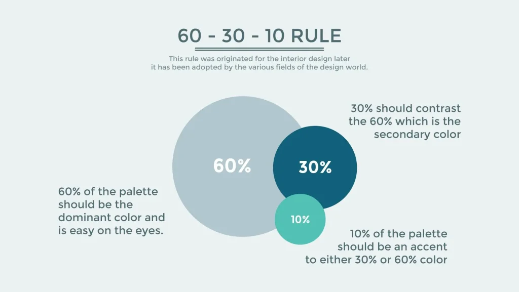
A well-balanced website colour scheme follows the 60-30-10 rule:
- 60% – Primary Color: The dominant shade that sets the overall tone.
- 30% – Secondary Color: A complementary hue that enhances contrast.
- 10% – Accent Color: Used for call-to-action buttons, links, or highlights to draw attention.
This rule ensures visual balance while keeping the design engaging and user-friendly.
How to Choose Your Colour Scheme for Web Design
Selecting the right colors involves considering the website’s purpose, target audience, and brand message. Key factors include:
- Brand Identity: Colors should align with the brand’s personality and values.
- Readability & Accessibility: High contrast improves text readability, ensuring inclusivity for all users.
- User Experience: Warm colors create excitement, while cool tones promote calmness.
By understanding how to choose your colour scheme wisely, you can create a website that not only looks stunning but also enhances usability and engagement.
Frequently Asked Questions
We are always happy to help, if you can’t find the information you are looking for please don’t hesitate to reach out to us!
CTAs guide users toward desired actions like signing up or purchasing. Clear, visible CTAs improve engagement and drive conversions.
Good navigation is simple, logical, and consistent, helping users find information quickly and improving site usability and SEO.
Responsive design ensures your website looks and functions well on all devices, improving user experience and boosting SEO rankings.
Essential elements include intuitive navigation, responsive layout, fast loading speed, clear calls-to-action (CTAs), consistent branding, accessible design, and quality content.
Visual hierarchy organizes content by importance using size, color, spacing, and layout, guiding users’ attention effectively.
Astrihost offers SSL certificates for free with all hosting plans, ensuring your site is secure from day one.
It’s a good practice to review and update your website’s UX regularly, at least every 6-12 months, to keep up with evolving user expectations and technology.
Did you find this article informative? Share it with your friends!
